What readers will learn from this article:
- Definition and importance of “above the fold” in web design
- The impact of above the fold on user engagement, conversion rates, and search engine optimization (SEO)
- Key elements to include above the fold, best practices, and common mistakes to avoid
- Optimizing above the fold for different devices and the evolution of above the fold design
In the world of web design, above the fold is a concept that holds immense power in capturing the attention of visitors and driving them towards desired actions. But what exactly does “above the fold” mean in web design? In this article, we will delve into the definition of above the fold in web design, explore its importance, and discuss how it can be optimized to enhance user engagement and conversion rates.
Definition of “above the fold” in web design
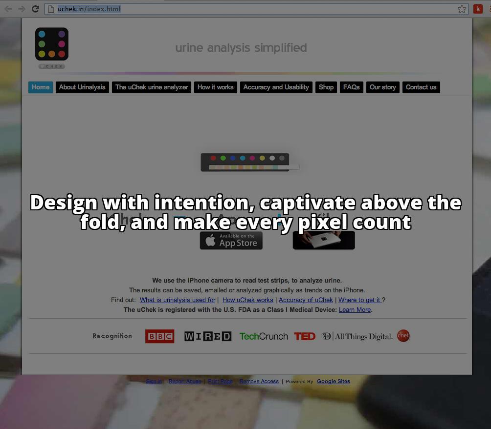
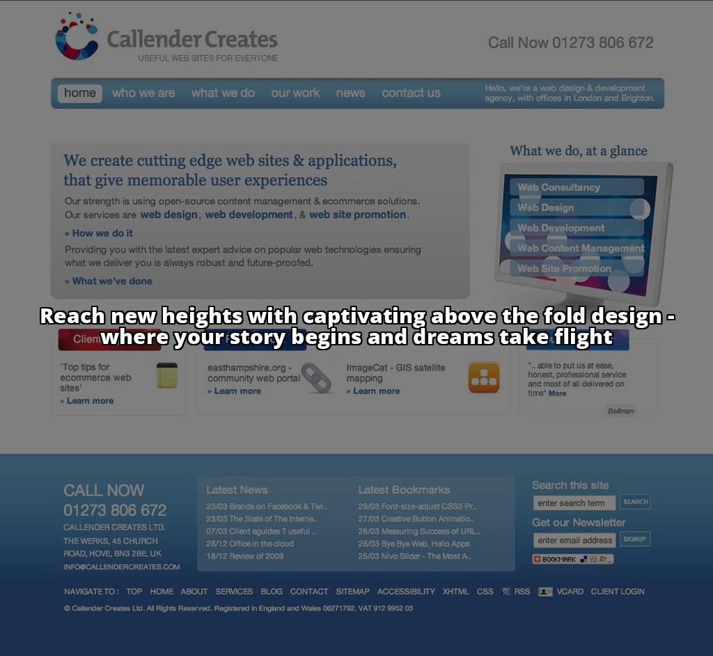
In the early days of newspapers, the most important stories and headlines were placed on the top half of the front page, as this section was the most visible when the newspaper was folded and displayed on newsstands. This area was referred to as “above the fold.” Similarly, in web design, above the fold refers to the portion of a webpage that is visible to users without the need for scrolling. It is the first impression that visitors have when landing on a website and plays a crucial role in capturing their attention and guiding their actions.
Importance of designing the above the fold section
The above the fold section of a website is like the gateway to the rest of the content. It determines whether visitors will stay and explore further or quickly bounce away. The design and layout of this section can make or break the user experience and significantly impact the success of a website. When done effectively, it can engage users, convey key messages, and encourage them to take desired actions such as making a purchase, subscribing to a newsletter, or filling out a contact form. Now, let’s explore why above the fold design is so significant.
The Significance of Above the Fold Design
Understanding user behavior and attention span
In today’s fast-paced digital world, users have limited attention spans and high expectations. They want to find what they’re looking for quickly and easily. Research has shown that users typically spend only a few seconds scanning a webpage before deciding whether to continue exploring or leave. This makes the above the fold section even more critical, as it is the first opportunity to capture and retain users’ attention.
Impact of above the fold on user engagement and conversion rates
The design and content presented above the fold can have a profound impact on user engagement and conversion rates. A well-designed above the fold section can entice visitors to stay longer, explore further, and take desired actions. On the other hand, a cluttered or unappealing above the fold section can drive users away, resulting in high bounce rates and missed conversion opportunities.
Relationship between above the fold and search engine optimization (SEO)
In addition to its impact on user engagement, the above the fold section also plays a significant role in search engine optimization (SEO). Search engines like Google consider user experience as a crucial ranking factor. If your above the fold section is engaging, relevant, and encourages users to stay on your website, it sends positive signals to search engines, which can improve your website’s visibility in search results. This highlights the importance of optimizing the above the fold section to enhance both user experience and SEO performance.

Key Elements to Include Above the Fold
To optimize the above the fold section and make it compelling for users, there are several key elements that should be included. Let’s explore each of these elements in detail:
Captivating headline that captures attention
The headline is the first thing visitors see when they land on a webpage. It should be attention-grabbing, concise, and clearly convey the value or benefit that users can expect from the website. A compelling headline can pique curiosity and encourage users to explore further.
Clear call-to-action to guide user actions
A call-to-action (CTA) is a crucial element above the fold, as it guides users towards the desired action. Whether it’s making a purchase, subscribing to a newsletter, or contacting the business, the CTA should be prominently displayed and visually appealing. It should clearly communicate what users need to do and create a sense of urgency or incentive to encourage immediate action.
Visually appealing images or videos to enhance the design
Visual elements such as images or videos can significantly enhance the above the fold design. They can capture attention, convey emotions or messages, and make the webpage more visually appealing. However, it’s essential to choose visuals that are relevant to the content and resonate with the target audience. Generic or low-quality visuals can have a negative impact on user perception and engagement.
Concise and scannable content to convey key messages
While visuals are crucial, it’s equally important to include concise and scannable content above the fold. Users should be able to quickly understand what the website is about and what value it offers. Use short paragraphs, bullet points, and bolded or highlighted key phrases to make the content easily scannable and digestible. Avoid overwhelming users with excessive information, as this can lead to cognitive overload and drive them away.
By incorporating these key elements above the fold, you can create a visually appealing and engaging experience for users, enticing them to explore further and take desired actions.
Optimizing Above the Fold for Different Devices
Importance of responsive design for seamless user experience
In today’s mobile-centric world, it’s crucial to optimize the above the fold section for different devices. Responsive design ensures that the website adapts seamlessly to various screen sizes and resolutions, providing an optimal user experience regardless of whether users are accessing the site from a desktop, tablet, or mobile device. A responsive design ensures that important elements above the fold are visible without the need for excessive scrolling or zooming.
Adapting above the fold content for desktop, tablet, and mobile screens
When optimizing above the fold for different devices, it’s important to consider the limitations and unique characteristics of each screen size. For desktop screens, you have more real estate to work with, allowing for larger images and more content. On the other hand, mobile screens have limited space, requiring more concise and streamlined content. By tailoring the above the fold content to each device, you can ensure that users have an optimal experience, regardless of the device they are using.
Ensuring important elements are visible without excessive scrolling
Regardless of the device, it’s crucial to ensure that important elements above the fold are visible without the need for excessive scrolling. Users should be able to see the captivating headline, clear call-to-action, and relevant visuals without having to scroll down. This ensures that you immediately capture their attention and provide them with the necessary information to make an informed decision or take action.
By optimizing the above the fold section for different devices, you can provide a seamless and engaging experience for users, regardless of how they access your website.
Best Practices for Above the Fold Design
To create an effective above the fold design, it’s important to follow some best practices. Let’s explore these practices in detail:
Keeping the design clutter-free and visually appealing
A cluttered design can overwhelm users and make it difficult for them to find what they’re looking for. Keep the above the fold section clean, organized, and visually appealing. Use ample white space to create a sense of balance and allow important elements to stand out. Avoid overcrowding the section with excessive text or visuals that distract from the main messages.
Avoiding excessive use of ads or pop-ups that distract users
While ads and pop-ups can generate revenue or capture leads, excessive use of them can be detrimental to user experience. Intrusive ads or pop-ups that distract users from the main content can lead to frustration and drive them away. If you choose to include ads or pop-ups above the fold, ensure that they are relevant, non-intrusive, and do not hinder users’ ability to navigate the website or access the main content.
Utilizing contrasting colors to highlight important elements
Colors play a vital role in capturing attention and guiding user focus. Utilize contrasting colors to highlight important elements such as the headline, CTA, or key messages. This creates visual hierarchy and draws users’ eyes to the most critical parts of the above the fold section. However, be mindful of using colors that are consistent with your brand and resonate with your target audience.
Optimizing loading speed for better user experience
Website loading speed is a crucial factor in user experience and SEO. Slow-loading websites can frustrate users and lead to high bounce rates. Optimize the above the fold section and the entire website for fast loading speed. Compress images, minify code, and leverage caching techniques to reduce load times. This ensures that users can quickly access the above the fold content and have a seamless browsing experience.
By following these best practices, you can create an above the fold design that is visually appealing, user-friendly, and optimized for maximum engagement and conversions.
Testing and Optimizing Above the Fold Content
Creating an effective above the fold design requires continuous testing, optimization, and refinement. Let’s explore some strategies to test and optimize your above the fold content:
Conducting A/B testing and gathering user feedback
A/B testing involves creating multiple versions of the above the fold section and randomly displaying them to users. By comparing the performance of different variations, you can identify which design, layout, or content elements resonate best with your target audience. Additionally, gather user feedback through surveys or usability testing to gain insights into their preferences, pain points, and suggestions for improvement.
Experimenting with different layouts, headlines, and visuals
Don’t be afraid to experiment with different layouts, headlines, and visuals above the fold. Test different combinations to see what works best for your target audience. Try variations in the positioning of the headline, the size and placement of visuals, or the wording of the call-to-action. By testing and experimenting, you can uncover new insights and optimize your above the fold content for maximum impact.
Analyzing data and user behavior to refine the design
Data analysis plays a crucial role in refining and optimizing above the fold content. Use analytics tools to track user behavior, such as time spent on the page, bounce rates, and conversion rates. Analyze this data to identify patterns, trends, and areas for improvement. For example, if you notice high bounce rates, it may indicate that your above the fold design is not effectively capturing users’ attention or conveying the value of your website.
By testing, experimenting, and analyzing data, you can continuously refine and optimize your above the fold content to maximize user engagement and conversions.

Examples of Effective Above the Fold Designs
To gain inspiration and insights into effective above the fold designs, let’s showcase a few successful websites and analyze the elements that contribute to user engagement:
Showcasing successful websites and their above the fold choices
Website: Select Simon Markus
Select Simon Markus, a leading provider of SEO services, has a captivating above the fold design that immediately captures attention. The headline “Boost Your Website’s Rankings with Expert SEO Services” clearly conveys the value proposition, while the call-to-action “Get Started” prompts users to take action. The use of contrasting colors and visually appealing images further enhances the design.
Analyzing the elements that contribute to user engagement
Analyzing successful above the fold designs reveals common elements that contribute to user engagement. These include clear and concise headlines, visually appealing visuals, prominent CTAs, and a clean and clutter-free design. By incorporating these elements effectively, websites can create an above the fold section that engages users and encourages them to explore further.
The Evolution of Above the Fold Design
As technology advances and user behaviors change, the concept of above the fold design continues to evolve. Let’s explore two significant trends that have redefined the concept of above the fold:
The impact of mobile-first design on above the fold
With the rise of mobile devices, the importance of designing for mobile screens has become paramount. Mobile-first design prioritizes the mobile experience and ensures that the above the fold section is optimized for smaller screens. This means creating concise and scannable content, designing for touch interactions, and ensuring fast loading speeds on mobile devices. Mobile-first design has reshaped the way we think about above the fold, emphasizing the need for a seamless user experience regardless of the device.
Long-scrolling websites and redefining the concept of above the fold
Long-scrolling websites have gained popularity in recent years. These websites feature a single page that users can scroll vertically, with different sections or content blocks. The concept of above the fold is redefined in long-scrolling websites, as users can access content further down the page by simply scrolling. This has led to a shift in the way above the fold is approached, with a greater focus on creating engaging and captivating content throughout the entire page.
As technology and user behaviors continue to evolve, it’s important to adapt above the fold design strategies to stay relevant and effectively engage users.
Case Study: How Above the Fold Design Increased Conversion Rates for a Small Business
Attracting and converting customers online is crucial for small businesses. One example of the power of above the fold design in boosting conversions is the case of Jane’s Boutique, a small clothing store in a competitive market.
Jane had a beautiful website showcasing her unique clothing collections, but she was struggling to turn website visitors into paying customers. She decided to optimize her above the fold section to capture the attention of her target audience and guide them towards making a purchase.
First, Jane focused on a captivating headline that highlighted the key benefits of her clothing line: “Elevate Your Style with Jane’s Boutique: Unleash Your Inner Fashionista.” This headline immediately grabbed the attention of visitors and conveyed the value of her products.
Next, Jane incorporated a clear call-to-action (CTA) above the fold. She replaced a generic “Shop Now” button with a more compelling CTA that said, “Get 20% off your first order: Shop Now.” This incentivized visitors to take action and make a purchase, while also creating a sense of urgency.
To enhance the design, Jane used visually appealing images that showcased her best-selling clothing items. These images conveyed the style and quality of her products, enticing visitors to explore further.
Lastly, Jane made sure her above the fold content was concise and scannable. She highlighted the key features and benefits of her clothing line in bullet points, making it easy for visitors to quickly understand what sets her boutique apart from the competition.
After implementing these changes, Jane’s Boutique saw a significant increase in conversion rates. The optimized above the fold design effectively captured the attention of her target audience, guided them towards making a purchase, and conveyed the value of her products.
This case study demonstrates the impact of above the fold design on small businesses. By understanding the needs and preferences of their target audience and implementing key elements like captivating headlines, clear CTAs, visually appealing images, and concise content, small business owners can optimize their above the fold section to increase conversions and grow their online presence.
Common Mistakes to Avoid in Above the Fold Design
While understanding best practices for above the fold design is crucial, it’s equally important to be aware of common mistakes that should be avoided. Let’s explore some of these mistakes:
Overwhelming users with excessive information or options
Above the fold should provide users with a clear and concise overview of what the website offers. Avoid overwhelming users with excessive information, too many options, or complex visuals. Keep the content focused and streamlined to ensure that users can quickly understand the value proposition and take desired actions.
Using generic stock images that do not resonate with the target audience
Visuals play a crucial role in capturing users’ attention and conveying messages. However, using generic stock images that do not resonate with the target audience can undermine the effectiveness of the above the fold section. Invest in high-quality, relevant visuals that reflect your brand and resonate with your target audience.
Neglecting to optimize for different screen sizes and devices
With the increasing popularity of mobile devices, neglecting to optimize the above the fold section for different screen sizes and devices can be a costly mistake. Ensure that the design and content are responsive and adapt seamlessly to various devices. This ensures that users have a consistent and enjoyable experience, regardless of how they access your website.
By avoiding these common mistakes, you can create an above the fold design that effectively engages users and encourages them to take desired actions.
William, a seasoned web designer and user experience specialist, brings a wealth of knowledge and expertise to the field of web design. With over a decade of experience in creating engaging and user-friendly websites, William has honed their skills in understanding user behavior and designing for optimal conversion rates.
William holds a Bachelor’s degree in Computer Science with a focus on web development and design. Their passion for creating visually appealing and intuitive websites led them to pursue further studies in user experience design, where they gained a deep understanding of the psychology behind user engagement.
Throughout their career, William has worked with a diverse range of clients, from small businesses to large corporations, helping them unlock the power of above the fold design. By leveraging their expertise in responsive design, William ensures that websites are optimized for different screen sizes and devices, providing a seamless user experience across platforms.
Equipped with a data-driven approach, William conducts extensive A/B testing and analyzes user behavior, constantly refining their designs to achieve optimal results. Their commitment to staying up-to-date with the latest trends and best practices in web design has earned them a reputation as a trusted authority in the field.
Through this article, William aims to empower readers with practical insights and actionable tips to unleash the power of engaging web design and maximize the impact of the above the fold section.